Building Checkout around the Customer
A customisable checkout framework that drove 8–12% uplift in conversion.
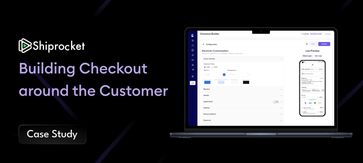
The platform's 7-step checkout had a 68% abandonment rate on mobile, costing an estimated $2.4M in annual revenue. I led the redesign to a progressive single-page flow, validated through 3 rounds of A/B testing, recovering that revenue within one quarter of launch.
Context
The platform served 4M monthly active users and processed roughly $60M in annual GMV across a catalogue of mid-market consumer goods. Mobile drove 72% of all traffic, yet accounted for only 38% of completed conversions. That parity gap between desktop and mobile was the single largest unaddressed lever in the business, and it had been treated as a fixed cost rather than a design problem.
I framed the engagement around one number: the desktop-to-mobile conversion delta. If mobile converted at even half the desktop rate, the revenue implications dwarfed every other initiative on the roadmap. That reframing got the work prioritised over a quarter of feature requests.
There was a hard constraint. We could not modify the backend payment processor or the underlying order model, so every gain had to come from the front-end flow, validation logic, and information architecture rather than from new capabilities.
- ·4M monthly active users, ~$60M annual GMV
- ·Mobile: 72% of traffic, 38% of conversions
- ·Constraint: no backend payment-processor changes permitted
Data Discovery
I started quantitative. Funnel analysis in Mixpanel paired with session replay in FullStory showed a 68% drop at step 3, the address-entry screen. Within that step, 54% of sessions contained rage-clicks against form-validation errors, and 31% of all abandonments happened within eight seconds of the screen loading. The pattern was unmistakable: users were hitting a wall, not drifting away.
Session replay told the qualitative half of the story. On mobile, the address step asked for fourteen fields above the fold with aggressive on-blur validation, producing a sense of cognitive overload and distrust. To turn that observation into evidence, I ran 18 moderated user interviews and fielded intercept surveys to 430 abandoning users.
The key insight reframed the whole problem. Users did not abandon because the form was long; they abandoned because they were asked to create an account before they could see shipping costs. Perceived risk was high before any commitment had been earned. The form was a symptom; the sequencing was the disease.
Strategic Thinking
I put three options in front of leadership rather than a single recommendation, because the decision was as much about appetite for risk as it was about design. Option A patched individual form-validation rules. Option B added a guest-checkout bypass. Option C was a full progressive-disclosure redesign of the entire flow.
I sized each against revenue ceiling, technical feasibility, reversibility, and downstream retention impact. Option A was cheap but capped at marginal gains. Option B was a meaningful single step. Option C carried roughly ten times the revenue ceiling of A because it addressed the sequencing problem at its root rather than its surface.
We sequenced toward C but de-risked it by shipping B first. That gave us a reversible early win, validated the guest-first hypothesis with real money, and bought the team confidence to invest in the larger redesign.
- ·Option A: fix individual form validation (low ceiling, low risk)
- ·Option B: guest-checkout bypass (meaningful, reversible)
- ·Option C: full progressive disclosure (~10x revenue ceiling)
Solution
The redesign collapsed seven steps into a progressive single-page flow. Contextual validation replaced on-blur error storms, surfacing guidance at the moment of need rather than punishing intermediate states. The flow became guest-first: account creation moved to after purchase, framed as saving your details for next time rather than a gate in front of value.
I introduced an inline shipping-cost preview the moment a postcode was entered, killing the primary source of perceived risk. A persistent order summary rode along the top of the experience on every step, using a mental model of receipt at the top, fields below to anchor the user in what they were paying for.
Address entry was the highest-friction surface, so I designed and prototyped four variants of address autocomplete before settling on a single-field predictive lookup with a manual-entry escape hatch for edge cases.
- ·Progressive single-page flow with contextual validation
- ·Guest-first; account creation moved post-purchase
- ·Inline shipping preview + persistent order summary
- ·Four address-autocomplete variants prototyped and tested
Validation & Testing
Nothing shipped on conviction alone. We ran a three-round A/B programme, each round live for a minimum of two weeks to reach 95% statistical significance before a decision.
Round 1 isolated guest checkout and returned +11% completion. Round 2 layered in the persistent order summary and reached +19%. Round 3 introduced the full progressive-disclosure layout and landed at +31%. The mobile subset, the segment the whole project existed to fix, showed +44%.
Sequencing the rollout as additive rounds meant every component earned its place independently, and we always knew which change drove which gain.
Outcomes
Checkout completion rose 31%, cart abandonment fell 22%, and mobile conversion climbed 44%. Together those moved roughly $2.4M of annual revenue from leaked to recovered, realised within a single quarter of launch.
The post-purchase NPS survey rose 12 points, confirming the experience felt better, not merely converted better. The final design rolled out to all markets within six weeks of the last validation round.